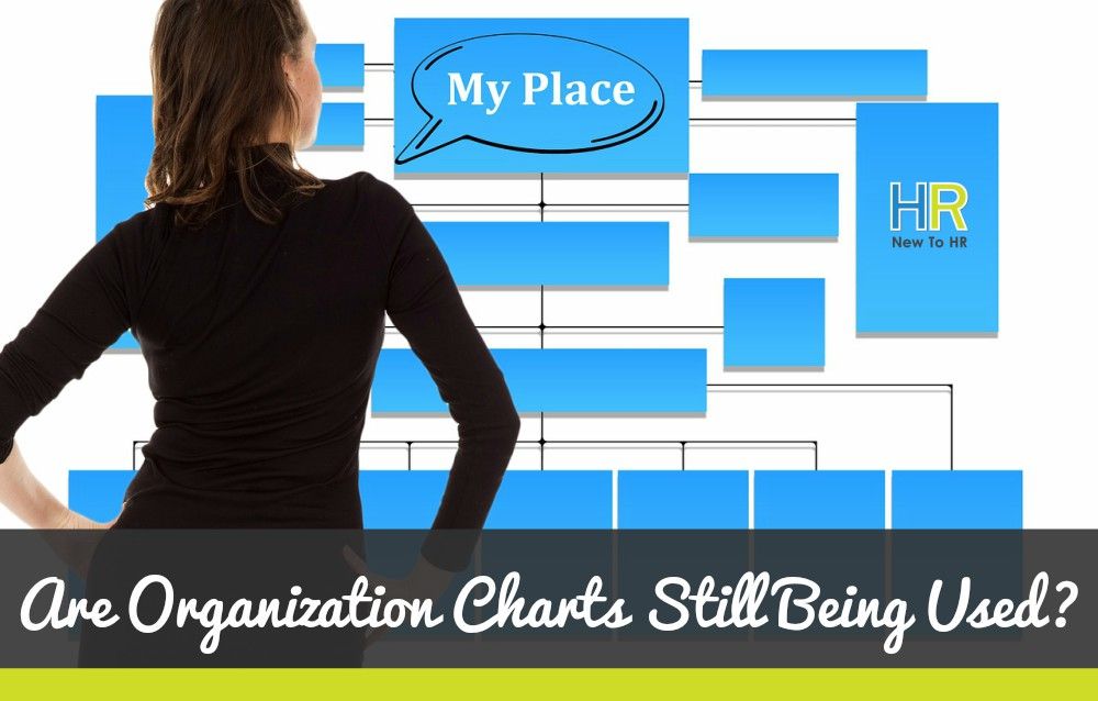
Are Organization Charts Still Used?
Charts often seem like things of the past, coming from a time when the online world did not exist, and mapping out goals and such information was important and necessary to share with co-workers.
We now live in a world where perhaps this is not necessarily the case. We can create a great deal of tools using programs and applications that can both record and sort information for us so that coworkers no longer need us to present information in such a way that we must use charts.
But are they really a thing we should get rid of?
Even with the internet, there is a lot you can do in order to make information sharing much easier.
Gathering information is easy—choose the right program and allow it to do most of the work when it comes to sorting or calculating that data however it should need to be polished.
When it comes to presenting that information, however, that’s a different story.
Programs will not fully understand the kind of audience you will be working with, or the scenario in which the information will be shared. Because of this minor problem with the systems, it can sometimes be better for the HR Professional to take the brunt of the work in order to create something that will both convey the information properly as well as hit the target audience!
In the past, charts and graphic organisers have looked pretty standard. They came in booklets or on posters, and feature graphs and information sorted in such a way that people know what to expect and can easily digest the information. However, now we are given the exciting opportunity to use new tools to make an even better, more colourful, and more simple organisational structure. It does not necessarily mean the old way of making charts is dead, but it allows for a better visual perception.
In recent years, many organisations have been playing around with different ways to convey information and facts.
Some have begun to make charts that no longer contain just a plain graph. Instead they include icons that show statistics, combined with clever and attractive charts, along with simple sentences that explain everything around it. Together, they make one flowing image that is beautiful to look at, and very informative. Other people teams have begun playing around with size and order when it comes to the words they use in their structure displays.
Perhaps companies and businesses will still need charts in their board rooms to convey information quickly to those used to a very classic style of sharing.
Yet, when it comes to sharing information with the outside world, trends point to the old organisation charts being removed as newer, brighter, and flashier information sharing is preferred, and is probably the new way forward.
People find that they have a more limited attention span for taking information and employees want their information quickly, and easily. This paves the future for companies to be more creative with a platform for team structures.
© New To HR